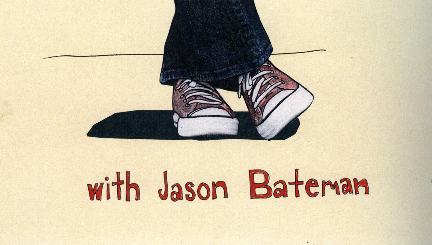
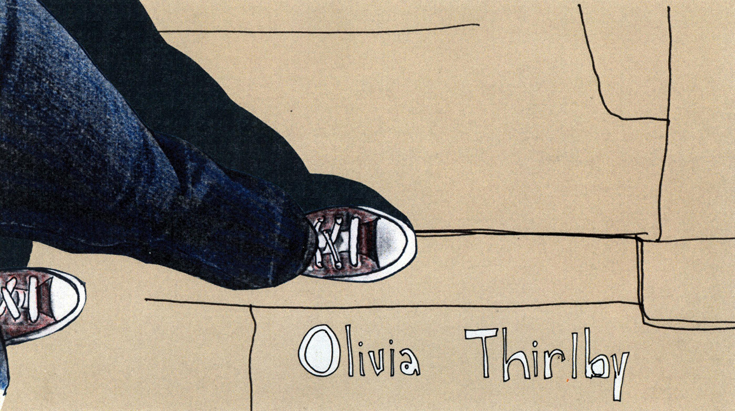
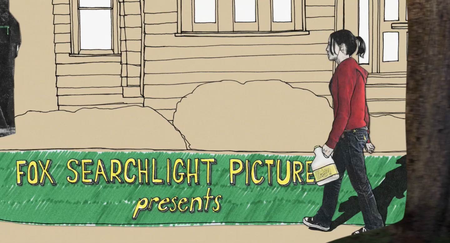
Juno / Making of
Jenny and I created the title sequence for Juno back in 2007, and we’re still asked questions about it. We’re so happy and flattered that this sequence has so many fans out there. If you’re curious about how we made this sequence, read on...
The Script
Everything in a film begins with the script. Usually we’re brought in to work on a title sequence sometime during post-production, but in this case we were fortunate enough to be given the script before the film was shot. This allowed us more time to develop an idea for the title sequence and to do stylistic explorations. It also allowed us to benefit from the film shoot, as you’ll see later.
In the script, the title sequence was to take place after the first few scenes of the film.

The style test

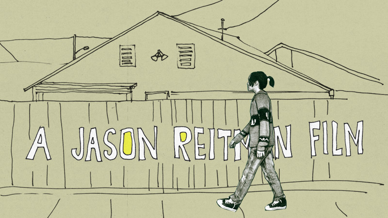
I had been wanting to experiment with xerox copied cut-out animation prior to working on Juno, and this seemed like the perfect time to explore this technique. We proposed two ideas to the director, Jason Reitman. The first was very simple: live-action shots of discarded furniture. The second idea was far more elaborate, and incorporated live- action, stop-motion and illustration. Jason was much more interested in the second idea.
We had the opportunity to do a quick test shoot with Elliot Page (Juno) before everyone departed to Vancouver for the film shoot. We then spent some time experimenting with the style, and produced the following brief style test and showed it to Jason. This is what got him excited about the idea:
Style Frames
Style frames are like storyboards, but are designed to look as close to the final shot as possible. They are frequently used in the pitching process for motion graphics in commercials and film title sequences. The client can look at a style frame and see what the final product will look like, just without the motion.
Before we shot the final sequence with the actress, we worked on developing quite a few style frames to get an idea of the kinds of shots we wanted to get. Jenny stood in for Elliot Page for most of the frames.
We didn’t go into the shoot with a rigid shot list. We wanted to be loose and to capture a wide variety of angles and shots in order to give ourselves latitude in the editing process.
Shooting the photos
Jenny and I made our way up to Vancouver to get what we needed for the title sequence while the film was being shot there. While we were waiting for some time to open up in Elliot’s shooting schedule, we wandered around the city and its neighborhoods, photographing elements and locations that might be usable in the sequence.
At the very end of the film shoot, we were able to spend a few hours working with Elliot to get the shots we needed to assemble the sequence. We shot on two cameras: a Panasonic HVX200 (remember those?) and an Canon DSLR. This was before video was available on the DSLR, so we were actually shooting using the burst mode at around 8 frames per second. This is generally the frame rate we used for the title sequence, which created a lovely stop-motion look.
For larger camera moves, we used shots from the video camera, and dropped the frame rate from 24 frames per second to 12 frames per second. I'll get into this a bit later, but each frame that appears onscreen required quite a bit of manual labor to prepare.
And since we were going to actually cut out each frame by hand (not digitally) we did not need a greenscreen. We were able to shoot using simple white backdrops, and sometimes no backdrops at all.

Gareth gets a hand-held shot of Juno. The gentleman in the black sweater follows behind Juno to make sure we had a white background for the hair.

We used a treadmill to get more stable looking walking shots of Juno.


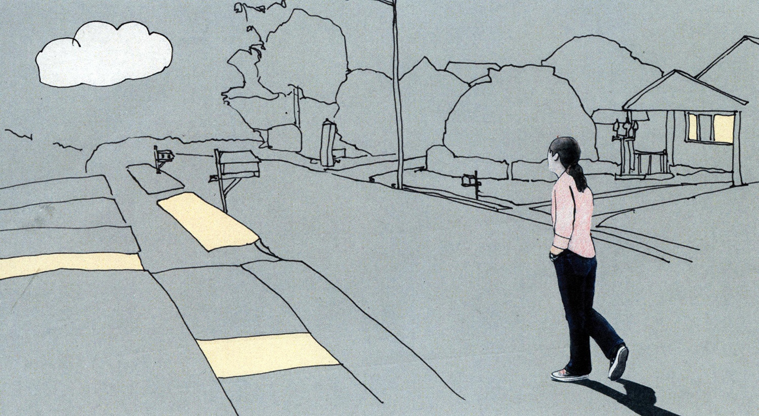
One of the advantages of developing the idea for the title sequence before the film was shot was that we were able to request a shot from the live action production team that would elegantly get us into the animated world. The idea was very simple: we needed a shot of Juno walking behind a tall vertical object. On one side of the object the world would be live-action, and on the other, animated.
We whipped up a couple of storyboards to show the idea to Jason, who was shooting the film in Vancouver.


Jason shot a lovely dolly shot of Juno walking through a neighborhood, then behind a large tree.
Here’s what the final shot looks like:

This is one of the reasons we encourage directors and producers to bring in the title designers very early in the production process. There’s a chance that the concept may benefit tremendously from the live-action shoot.
Cutouts
We had everything we needed from our Vancouver shoot, so now it was time for Jenny to load everything onto the computer and start editing in Final Cut. She meticulously went through every shot and still photo, and created an animatic. If you haven’t heard of an animatic, it’s basically a moving storyboard set to music. We use these to get a sense of the timing and pacing of a sequence. Often animatics are created using drawings, but in this case we had the shots of Juno, so this one was a moving photo montage.
Once Jason liked the edit we created, we started the hugely laborious process of stylizing the sequence. The main element was Juno herself. Many people think we developed a computer-based technique to produce the colored xerox look. It was, in fact, entirely created by hand.
Each frame of Juno in the sequence was individually created using the following process:
The frame was printed on an Epson ink jet printer (in black and white) onto heavy weight matte paper
Using a ballpoint pen, we drew the black outline around Juno onto the print
The frame was xeroxed
Then it was xeroxed again for that extra degraded xerox look
The xeroxed-xeroxed frame was then hand-colored with color pencils
Finally the colored image was then cut out with scissors
Each frame was scanned on a flatbed scanner and then stabilized in After Effects using the original footage as reference.
The following two videos show what the process looks like after step 5 (before cutting it out):
And here's what it looked like after cutting the frames out:
Needless to say this process took quite awhile, but it was, to be honest, an absolute joy to do. We held a couple "cutting parties" where we invited a bunch of friends over to help us get through a bunch of frames.

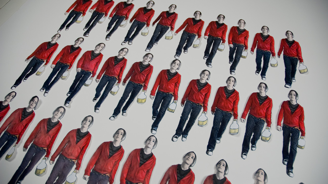
A stack of cutouts in Jenny's hand to give you a sense of scale
For some of the shots, like the one above, we left a little white border around Juno to help her “pop” against the color backgrounds.

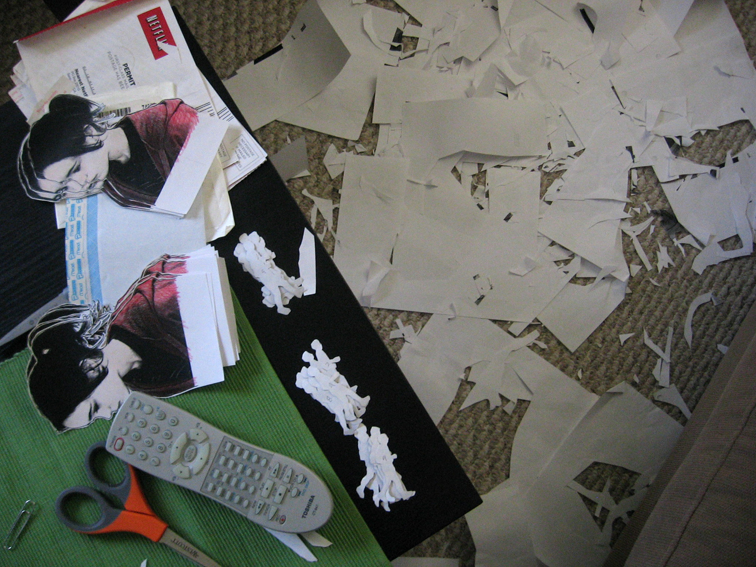
Jenny and I did much of this part of the process at home in our apartment. The floor was covered with paper debris. Netflix kept us company during the long hours.

Our small dining room became the shot board wall which helped us track the progress of each shot.
The illustrations
Jenny created all of the illustrations that appear throughout the title sequence. We workshopped the illustration style quite a bit to dial in the right feel. The final style was graphic, simple and contemporary.
Most of the illustrations were based on the location photographs we captured in Vancouver.
The color palette was strict: we only allowed ourselves three solid colors for the backgrounds: blue, green and brown.

Once the illustration was scanned, we assembled the final shot in After Effects. As you can see in the above frame from the title sequence, we also used a grid paper texture and xeroxed textures (like the road) to add more detail to the environments.

I particularly like the above shot of Juno balancing because it mixes a locked-off background image with a walking shot of Juno. The runners draw the camera along to the next shot in the sequence. They appear throughout the film as well.


For this shot we wanted to transition between two drawings of the background as Juno walks by. To do this Jenny simply scanned the illustration as she worked on it, line by line.
Animated type
I don’t know if students still do this these days, but Jenny and I used to doodle like mad in our notebooks throughout our school years. It helped the time go by until the bell rang for dismissal.
The text Jenny drew for the sequence is her version of that text from her high school notebooks.
To create the animated look for the title cards, Jenny traced each title 4 times to produce a moving typographic loop.
On a side note: we created an animated type package inspired by the Juno typeface that you can use in your own projects called Wiggletype.


Jenny's hand animated typography
We were also asked to design the end crawl for the film as well, and ended up designing our own typeface for the crawl. Jenny named it “Kaylee” after her niece.

Jenny also designed and animated the season title cards that appear several times throughout the film. These were a last-minute request after we finished the title sequence, so Jenny had to power through these in a few days.
The final product
After many weeks of work, we finished the sequence. It’s always a bit anti-climactic when we deliver final title sequences. There’s always quite a long delay between dropping off the final sequence and seeing it in a movie theater.
Every film we’ve worked on goes through what’s called a Digital Intermediate (DI). This name came to be when folks were still shooting films on, well, film. The digital intermediate is the process of scanning the film, storing it digitally, then doing all color manipulations and corrections onscreen in real-time using an incredibly advanced computer system.
These days most films are shot digitally, but they still go through the same process, without the film scanning.
This allows us to spend some time working with someone called a colorist: an expert in the incredibly technical and artful process of adjusting color of films.
If you’re curious, you can watch the full frame version of the title sequence below. The format of the film was Academy 1:85, which was then cropped when projected in movie theaters. So you’ll see the raw edges of the sequence that were not meant to be seen in the final sequence, but provide an interesting expanded view of the sequence.